Algunos
Proyectos
Estos son algunos de mis últimos proyectos. Si quieres ver más, puedes ir al apartado de Portfolio.


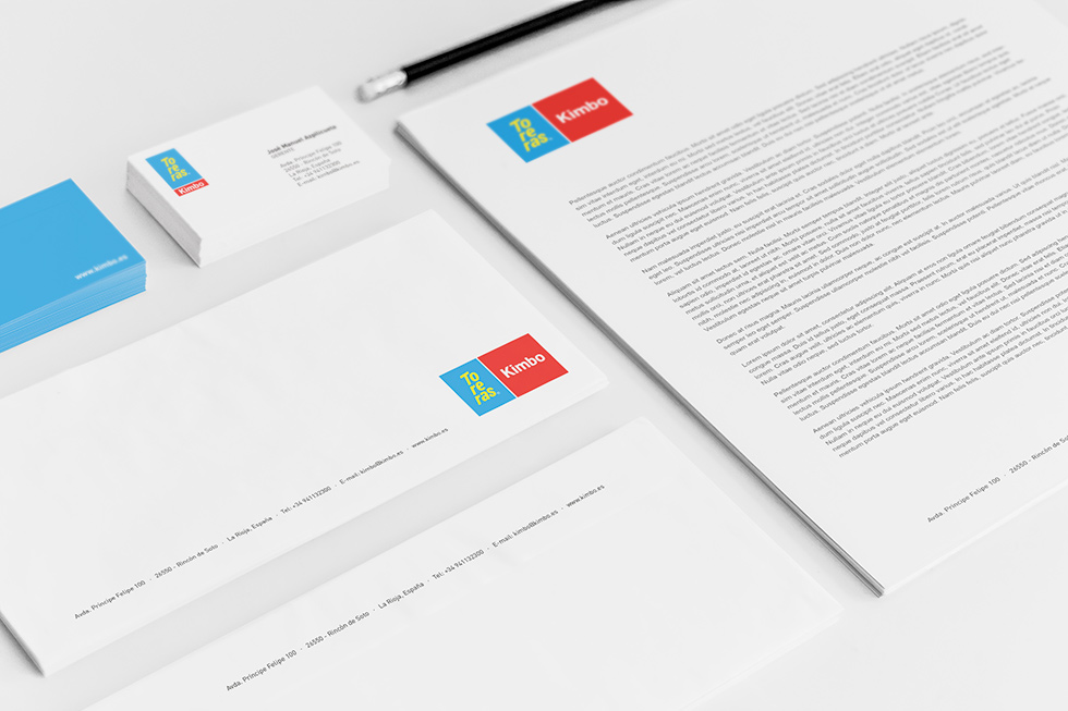
TORERAS KIMBO is a leading snack canned tapas company, with over 70 years of history.
Challenge
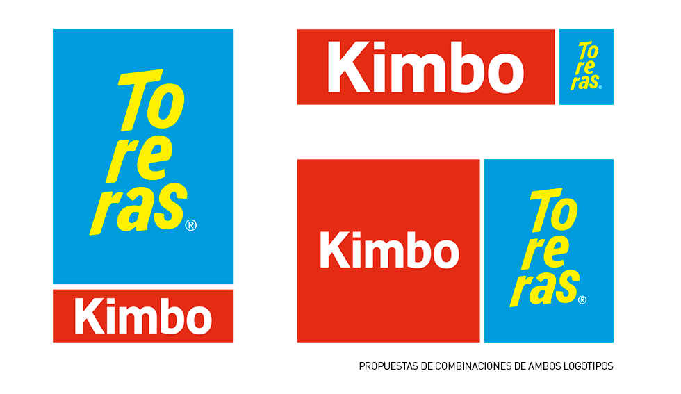
For the relaunch of its packaging, the client first requested the redesign of its classic logo.
Being a company with so much history, well known for its consumers, the objective was to keep the “typical spanish” aesthetic, giving it a renewed and fresh look.
Solution
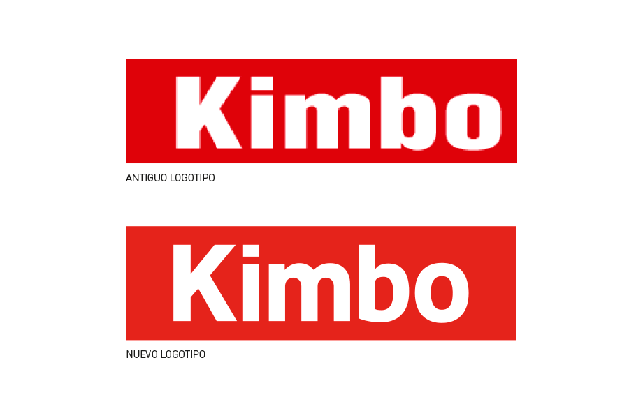
In the case of the word KIMBO, the red container structure (which is an essential element of this brand) was maintained. I worked with a family font with rounder, softer and more modern lines.
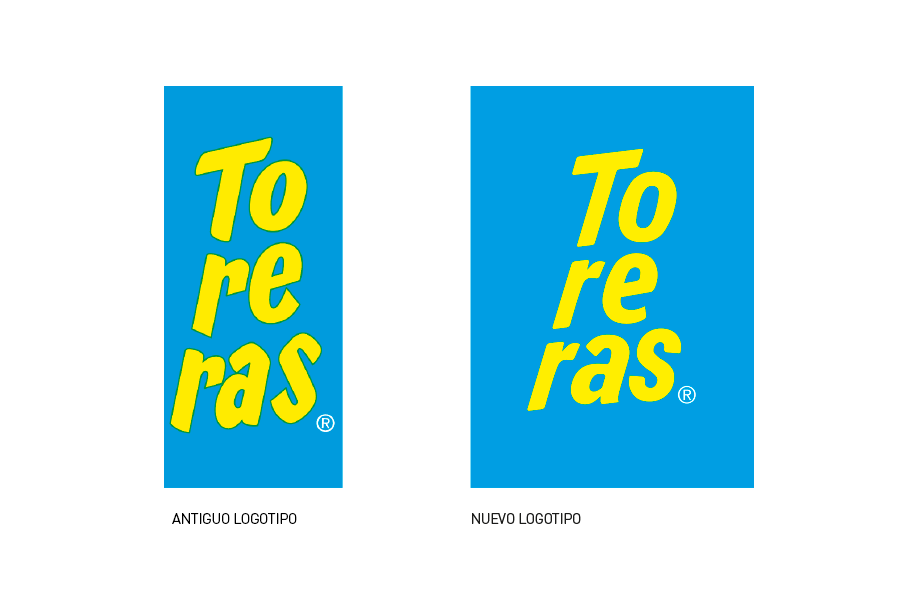
For the Toreras logo, its 3-line word distribution was kept like in the original, as it is the most recognizable element of the logo. I used a similar font family, with rounded strokes to make it look warmer, and finally inclining the angles.
The clients should be able to recognise the lifetime logo, while noticing that “something” has changed: the logo now looks better, clearer, and more modern.
Other projects for KIMBO: