
Algunos
Proyectos
Estos son algunos de mis últimos proyectos. Si quieres ver más, puedes ir al apartado de Portfolio.
TORERAS KIMBO is a leading snack canned tapas company, with over 70 years of history.
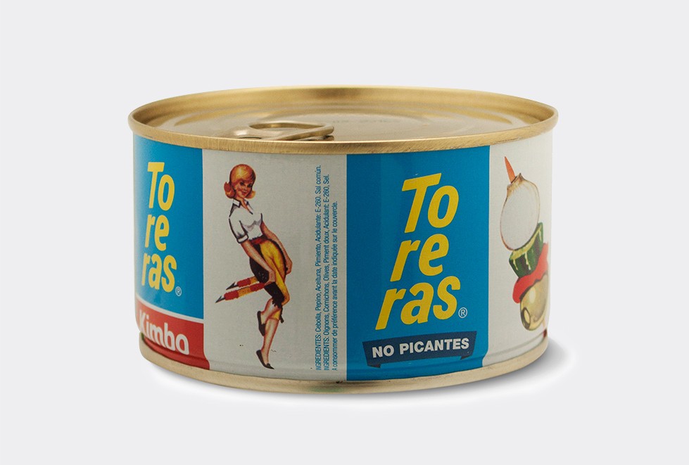
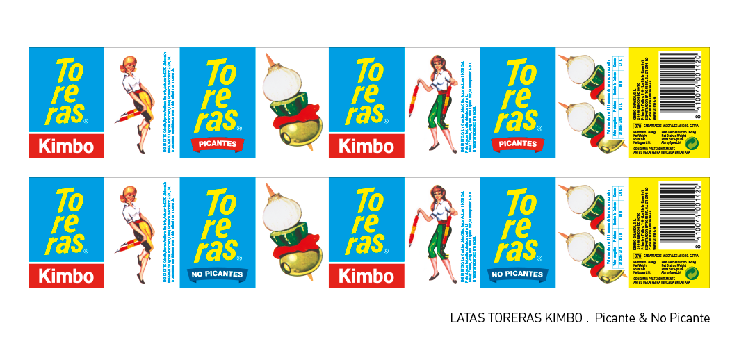
PACKAGING REDESIGN FOR TORERAS KIMBO
Challenge
For the relaunch of its packaging, the client asks for a re-styling. As KIMBO is a company with history, well known for its consumers, the key was to keep the “typical spanish” aesthetic, giving it a renewed and fresh look.
Solution
The aim of this redesign was to let customers easily find products on the shelves, but also to pleasantly surprise them to see that there’s a touch of renewal, a fresh look. They remain to be the lifetime Toreras, but are renewed. Along with the logo a label has been added (in blue or red) to differentiate the Spicy and not Spicy variety.
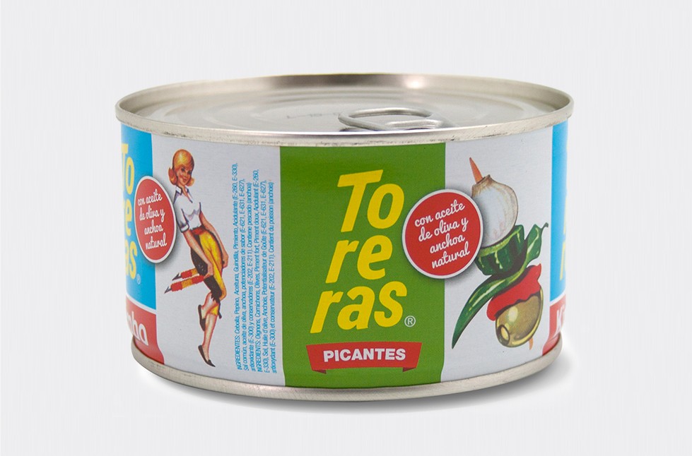
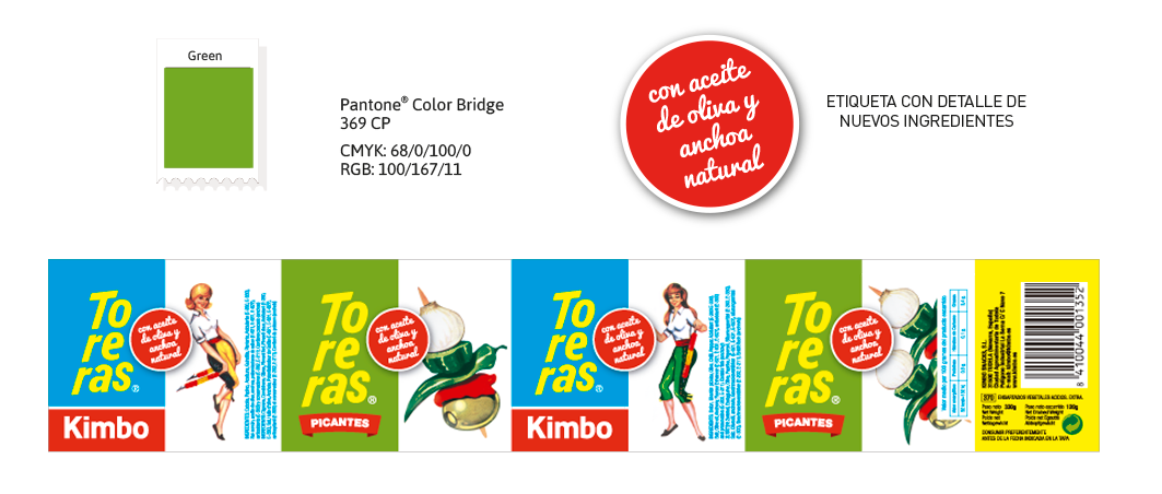
NEW TORERAS CAN WITH OLIVE OIL
Challenge
Kimbo needs a packaging design for a “line extension” to Toreras. The creation of a “line extension” means maintaining the base line graph, adding or modifying graphic elements to highlight the new flavor.
Solution
The original design is kept, but adding a new color as well as a new element (the circle). The chosen color is green, which refers to the color of the olives. This color is used only in two quadrants (those with the “hot” and “spicy” labels). In the quarters where the logo Toreras-Kimbo is corporate blue remains. This way, the identity of the can is retained. The label is the Kimbo red and includes within the new ingredients. The typeface chosen is the Pacific, which is the same that was used to differentiate the ingredients in the jars of Kimbo.
Other projects for Kimbo:
Estos son algunos de mis últimos proyectos. Si quieres ver más, puedes ir al apartado de Portfolio.
Sorry, no results were found, search again.
Juliana is a resolute, surprising, conscious and very inspiring person, as well as compliant, direct and results-oriented.
In the face of any challenge, she presents you with various solutions: from the most continuous to the most groundbreaking, but always aware of the importance and objectives of the project.
But perhaps what I value the most is her ability to get to know the client, the project and the company: she asks and asks questions to make sure that the final result is in line with what the company needs. Juliana speaks with clarity and sincerity, which greatly facilitates the creative process.
On a personal level, she is a close person, patient, very intelligent and fun. She is a magnificent ally.
It is a pleasure to recommend Juliana’s intuitive design talent and professionalism. She has a way of quickly putting her finger on the pulse of a project and “translating” the spirit, mission and values into images that connect with target audiences.
Diligent, responsive and efficient in turning things around within established timeframes, she offered me various design options and possible approaches before honing in on the one that really struck a chord with me.
I look forward to working with her again on future design needs!
One of the most capable, efficient and honest people I’ve met in my entire career. From the outset, she showed her enormous talent at all levels. It has been a real honor to work with her and an undoubted success to delegate her the creation of our website.
I have the opportunity to work with Juliana in a variety of projects from GOFLOW. Juliana is a great support for decision-making in terms of image and visual communication of these projects. She dominates her field, is professional, creates an excellent work environment, gives fast, accurate answers and has a deep knowledge of her discipline. It is a pleasure to work with Juliana and I highly recommend her.
Juliana is a great professional, strict in her commitments and creative in her creations. She has the added value of a comprehensive understanding of business communication.
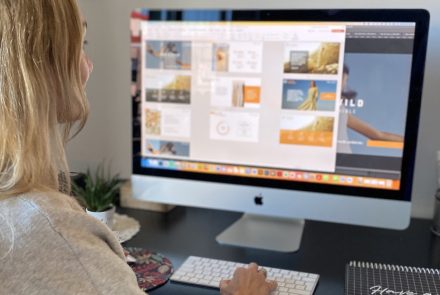
Aquí encontrarás información sobre diseño, consejos y experiencias del día a día.
Déjame ponerte en situación: Tienes un equipo de trabajo. Cada uno de ellos hace la presentación “a su manera”… creyendo que con sólo usar...
Continue Reading
Hace unos días hice esta encuesta en LinkedIn: “¿Cómo finalizas tu presentación?” Como prometí en el post, aquí están los resultados de la...
Continue Reading
Cuando una presentación se planifica y se diseña siguiendo unos pasos básicos, puede ser una herramienta de comunicación muy poderosa y persuasiva. Sé que...
Continue Reading
Las presentaciones digitales son muy poderosas. Pueden generar confianza, ayudar a conectar con tu audiencia...
Continue Reading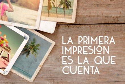
Lo escuchamos hasta el cansancio, y aunque parece muy obvio, la realidad es que no existe una segunda...
Continue Reading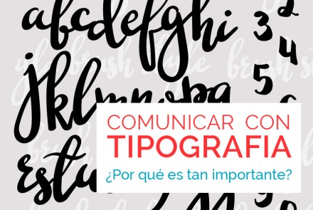
Lo que nos transmite la tipografía es algo que no podemos obviar. Ya sea que se trate del logo de tu empresa, como de...
Continue Reading