Branding SePrA
SUCCESS CASE
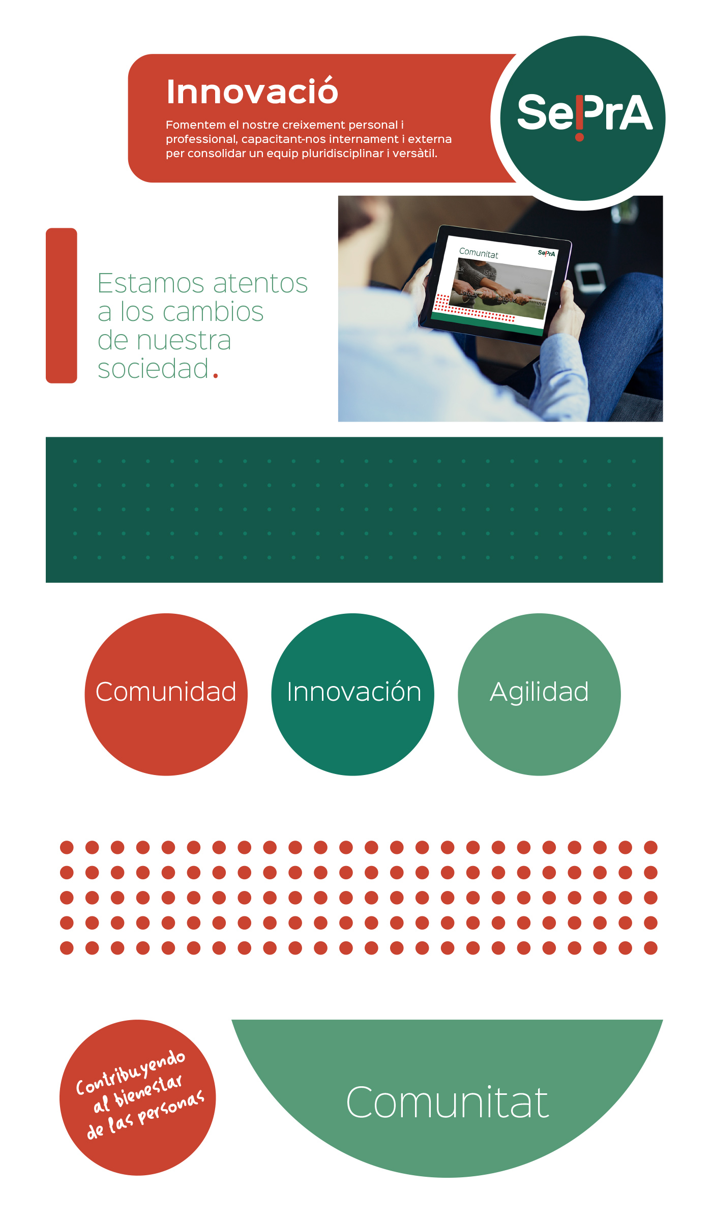
SePrA is a cooperative that offers Occupational Risk Prevention services.
Challenge
With more than 15 years of experience, SePrA wants to renew its corporate image. The main objective is to reflect the growth of the company, as well as their new values.
Solution
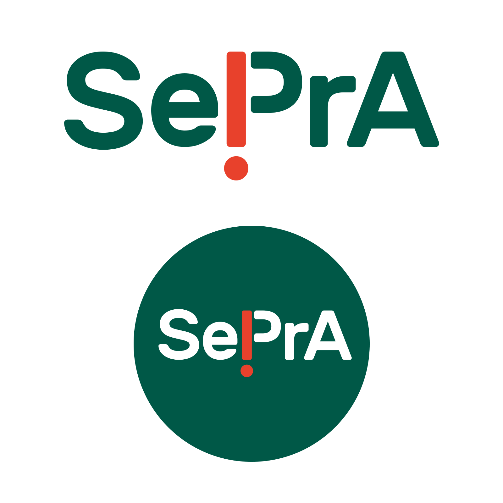
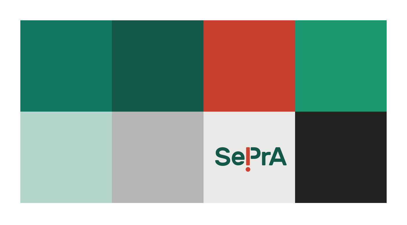
The client wants to keep the basic elements of the current logo. As a result, we decided to work on a restyling of the logo: keeping its essential structure (so that it can be recognized), with some modifications that make it lighter and more sophisticated.
The new logo is memorable, keeping the basic criteria of simplicity, understanding and readability.
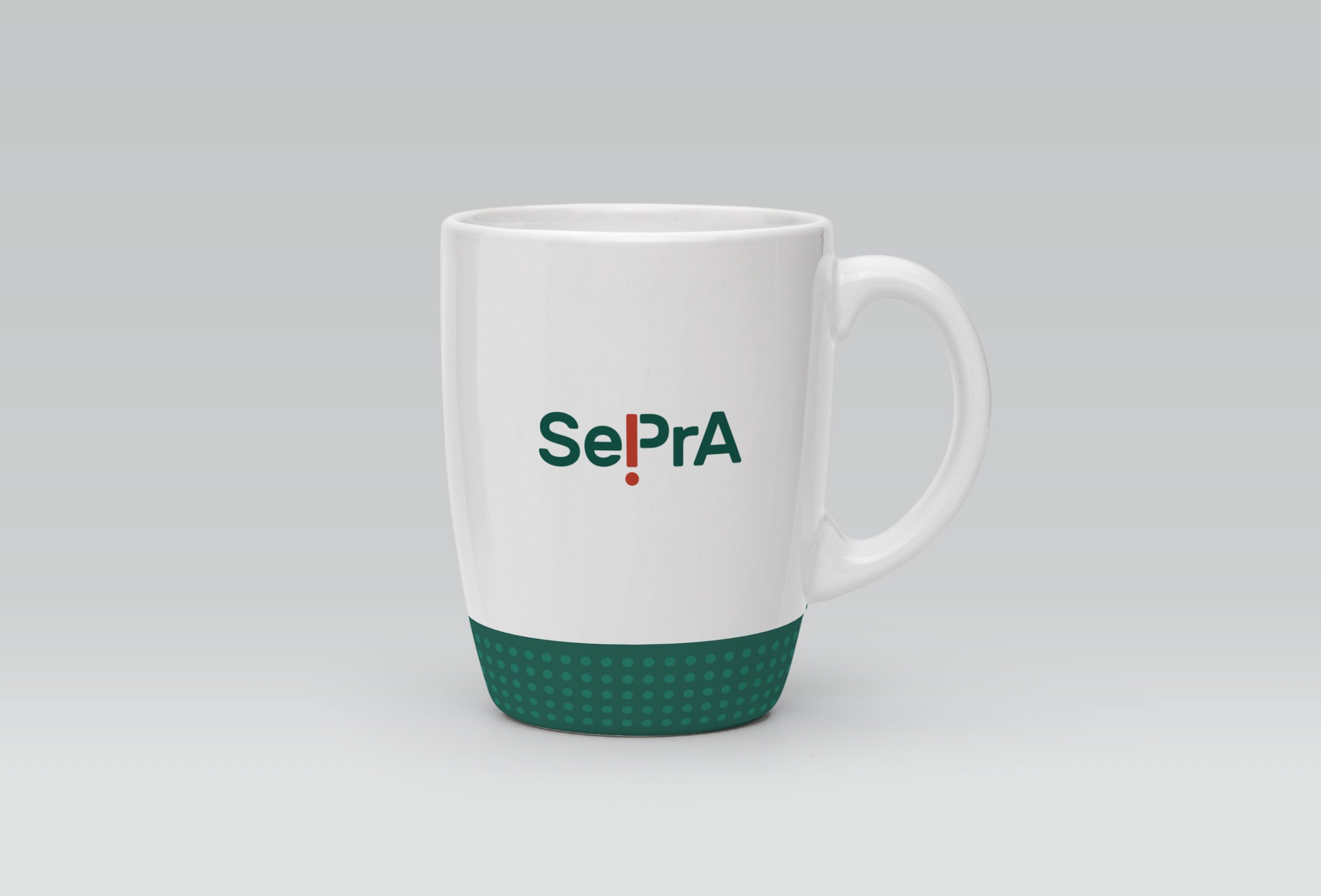
In addition to the main logo, a second stamp-style version was created.
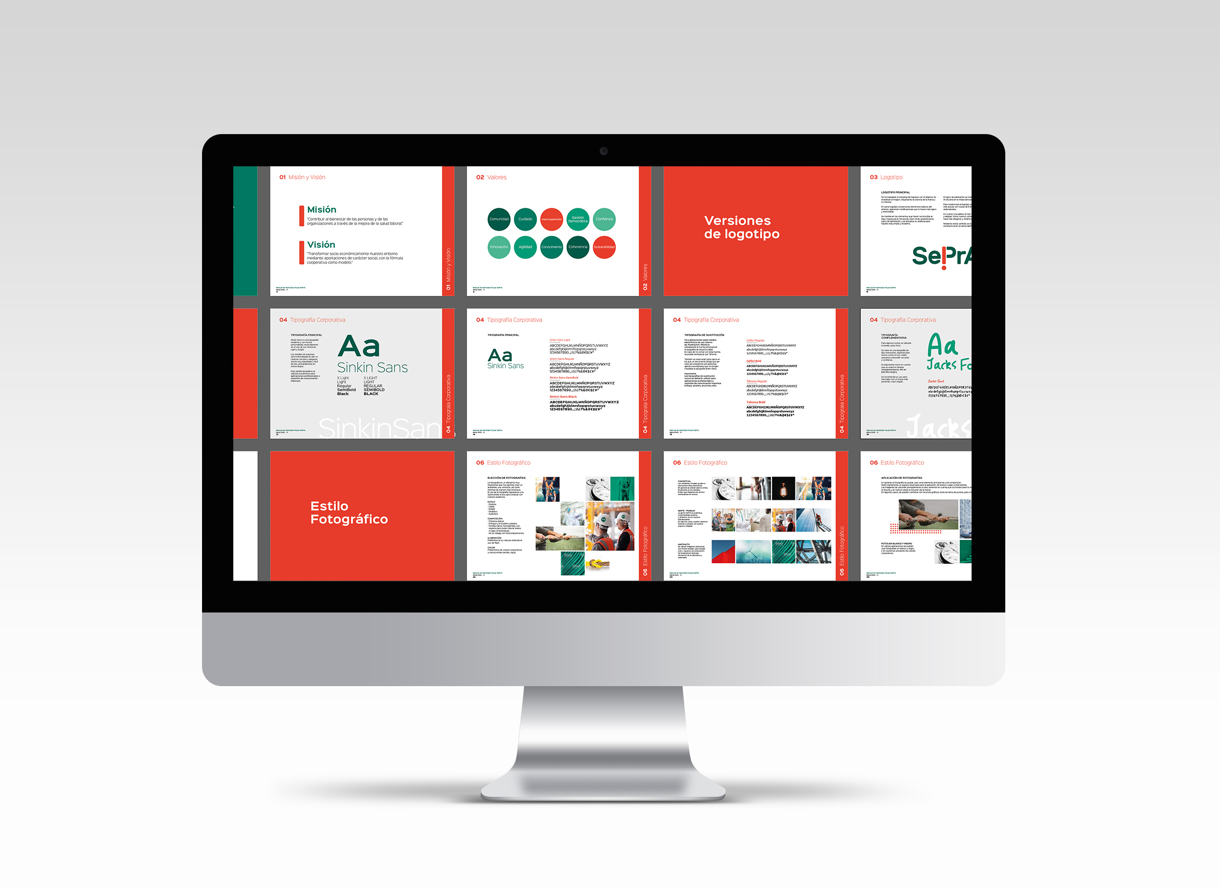
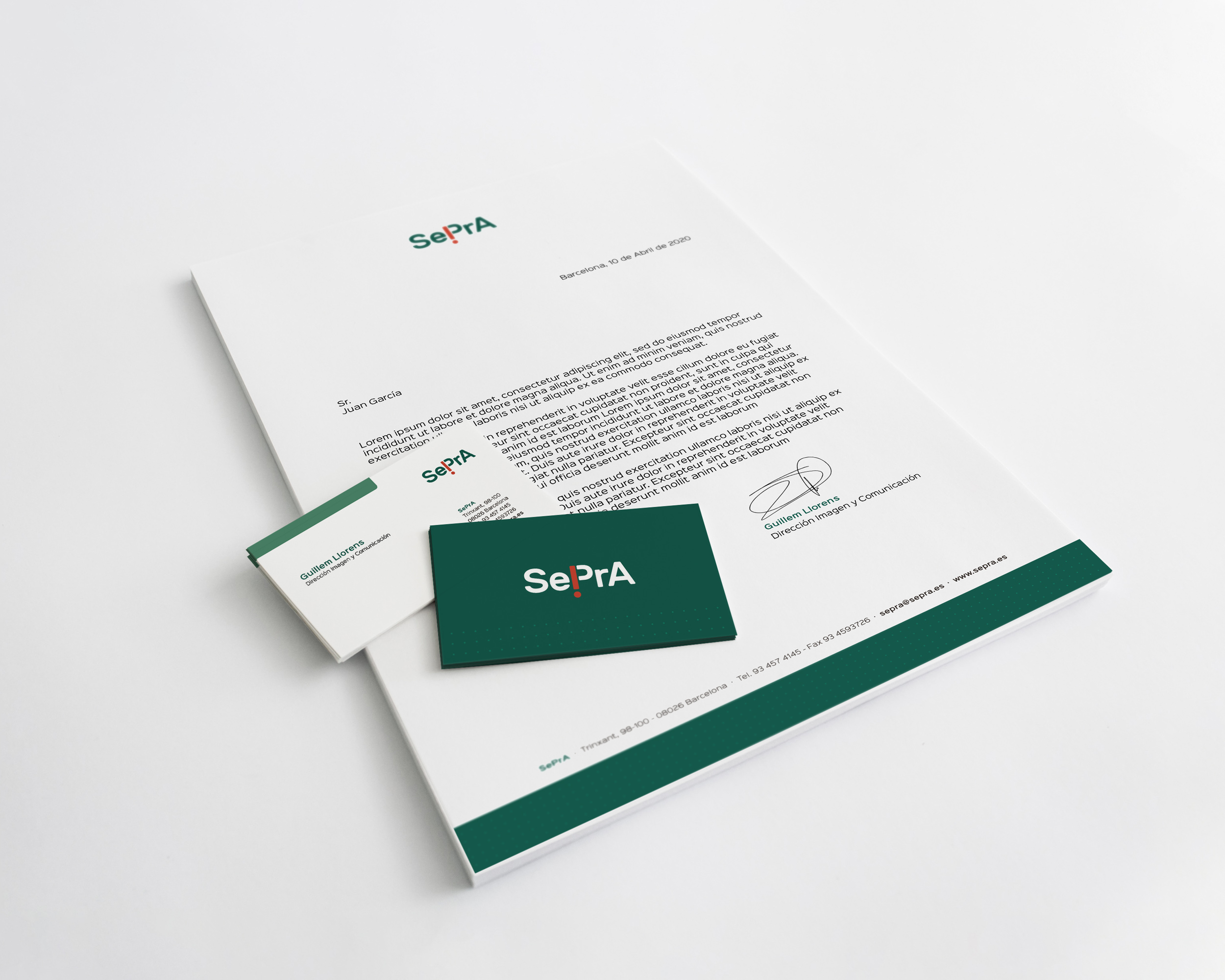
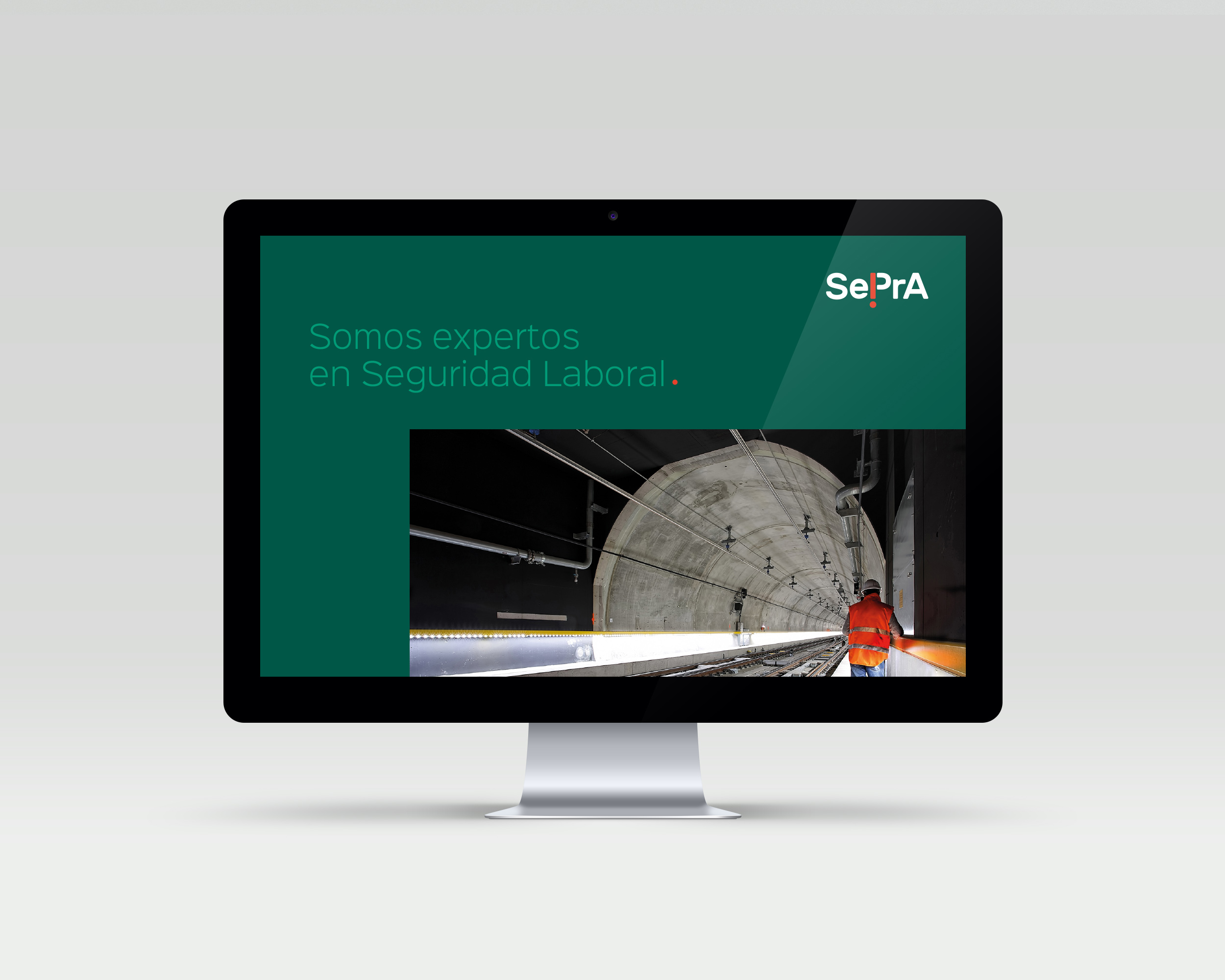
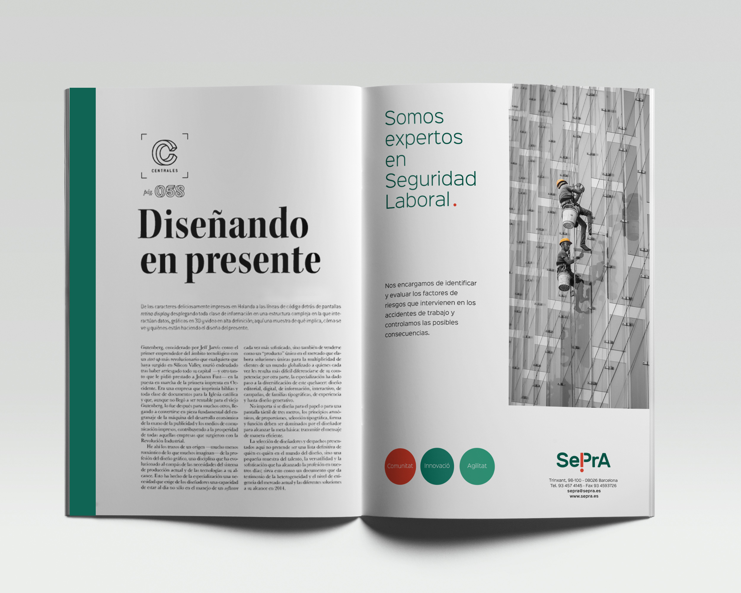
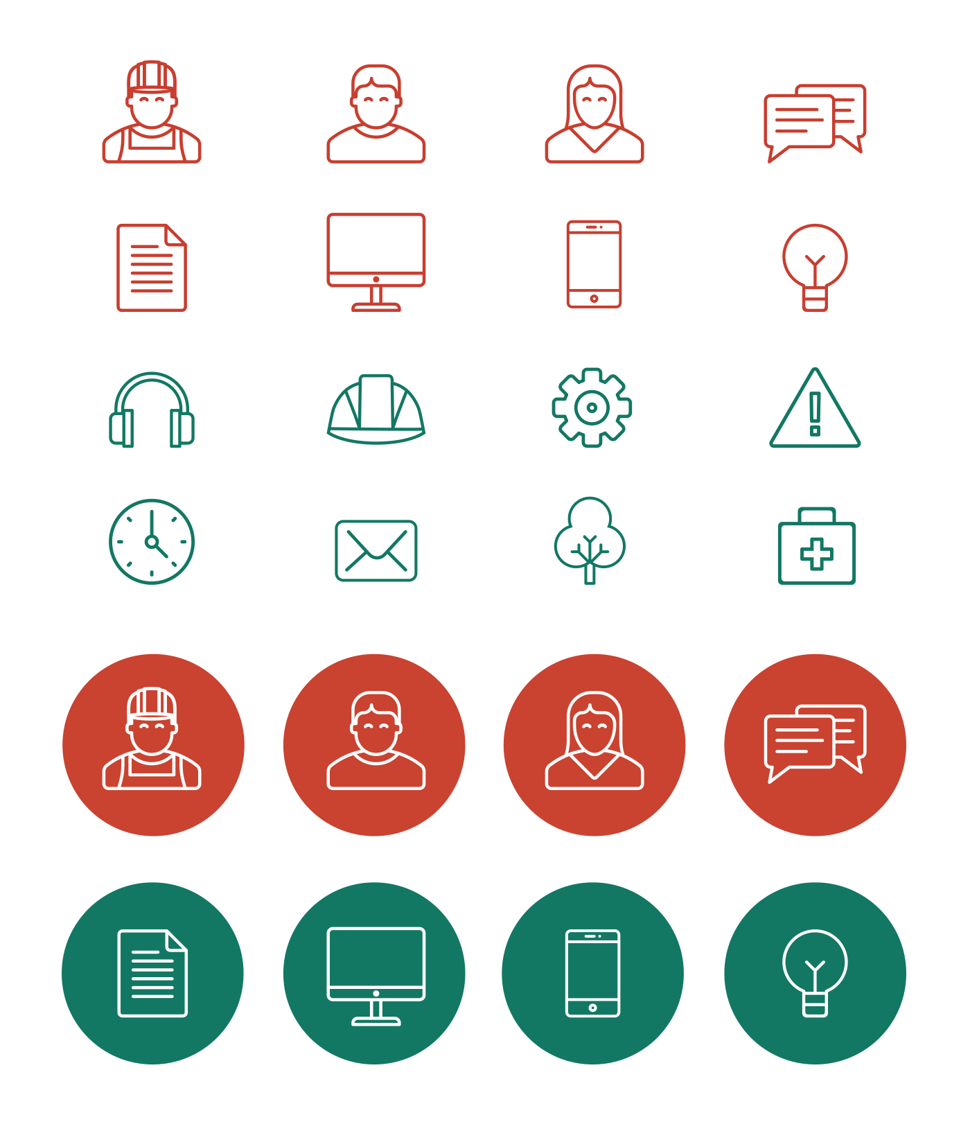
To reflect the evolution of SePrA, we designed a new visual universe, richer and more aspirational.
The new branding reflects the modernization of the company and focuses on its new values.
The consistency in the application of the graphic line makes all the elements being perceived as part of the SePrA brand.

Algunos
Proyectos
Estos son algunos de mis últimos proyectos. Si quieres ver más, puedes ir al apartado de Portfolio.
Sorry, no results were found, search again.
From the very beginning, after seeing her LinkedIn profile and website, I knew Juliana was the right person to create and design the presentation for our HELEGS Executive Program.
She conveys that she not only masters PowerPoint but also understands marketing. There are many professionals who know how to use the software, but very few truly understand what to communicate and how to communicate it effectively.
That combination is what convinced me to choose her Sales Power Slides service.
From our very first video call, I felt confident we were moving in the right direction. That confidence only grew when she explained the methodology she would use. Every step was carefully designed to build a message that was professional, clear, and persuasive. Both the process and the final result exceeded my expectations.
There are plenty of people who believe they know PowerPoint. But professionals who truly master it and, more importantly, take the time to understand your business, strengthen your messaging, and present it in the most effective way—are rare. Juliana is one of them.
At Meridia, we create a lot of presentations, and we wanted to take them to the next level. We were fortunate to find Juliana, who helped us achieve exactly that.
She designed a PowerPoint template that allows us to create presentations from scratch while staying fully aligned with our brand identity, making the entire process much faster and more efficient.
We also completed her two-session training program, where Juliana explained the fundamental principles of presentation design and shared a practical guide packed with useful PowerPoint tips and tools. The training was fully tailored to our specific needs and proved to be extremely valuable for the whole team.
I would definitely work with Juliana again. She is highly efficient, quickly understands a company’s needs, and is exceptionally organized and responsive. On top of that, she’s flexible, easy to work with, and makes the entire process seamless.
Juliana is a resolute, surprising, conscious and very inspiring person, as well as compliant, direct and results-oriented.
In the face of any challenge, she presents you with various solutions: from the most continuous to the most groundbreaking, but always aware of the importance and objectives of the project.
But perhaps what I value the most is her ability to get to know the client, the project and the company: she asks and asks questions to make sure that the final result is in line with what the company needs. Juliana speaks with clarity and sincerity, which greatly facilitates the creative process.
On a personal level, she is a close person, patient, very intelligent and fun. She is a magnificent ally.
I worked with Juliana on a corporate presentation for our company’s Annual General Meeting, and the entire experience was excellent.
Communication with her was always fast and efficient. She quickly understood exactly what we needed and translated it into a presentation that met our expectations perfectly.
Juliana is highly efficient, professional, and reliable. She delivered the project ahead of schedule while maintaining an outstanding level of quality.
If I ever need this type of work again, I wouldn’t hesitate to work with her. I highly recommend her.
Working with Juliana is a pleasure. She is reliable, highly organized, and manages timelines exceptionally well. The quality of her work is consistently outstanding.
Mi Blog
Aquí encontrarás información sobre diseño, consejos y experiencias del día a día.

Lo que dices es importante. Pero cómo lo dices… marca la diferencia
Hoy quiero contarte algo que me pasó hace un tiempo… y que me hizo darme cuenta de lo importante que es una buena presentación....
Continue Reading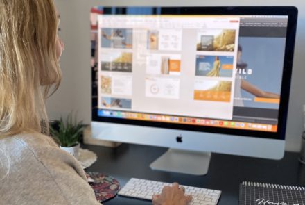
Ahorra tiempo con una plantilla corporativa
Déjame ponerte en situación: Tienes un equipo de trabajo. Cada uno de ellos hace la presentación “a su manera”… creyendo que con sólo usar...
Continue Reading
El ‘arte’ del cierre en una presentación
Hace unos días hice esta encuesta en LinkedIn: “¿Cómo finalizas tu presentación?” Como prometí en el post, aquí están los resultados de la...
Continue Reading
Las presentaciones digitales no tienen por qué ser aburridas
Cuando una presentación se planifica y se diseña siguiendo unos pasos básicos, puede ser una herramienta de comunicación muy poderosa y persuasiva. Sé que...
Continue Reading
5 claves para una presentación exitosa
Las presentaciones digitales son muy poderosas. Pueden generar confianza, ayudar a conectar con tu audiencia...
Continue Reading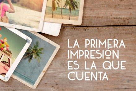
La primera impresión es la que cuenta
Lo escuchamos hasta el cansancio, y aunque parece muy obvio, la realidad es que no existe una segunda...
Continue Reading