Algunos
Proyectos
Estos son algunos de mis últimos proyectos. Si quieres ver más, puedes ir al apartado de Portfolio.


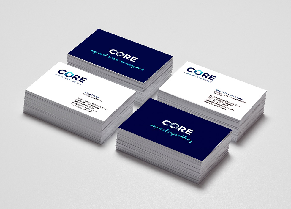
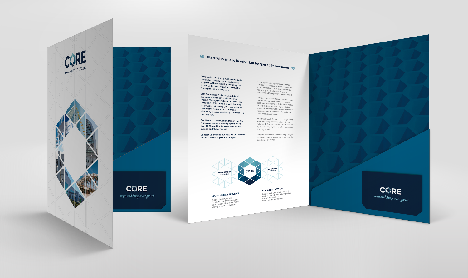
CORE is a company specialized in the construction sector, that provides a comprehensive consulting service in the fields of Engineering and Construction.
Challenge
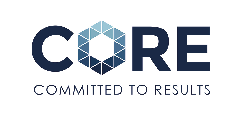
The customer requested that the logo reflected commitment, experience and efficiency.
It was also important to base the proposal on the attributes that are the essence of CORE:
Solution
The proposal was based on the concept of materialization. The icon that replaces the letter “O” suggests an element that is discovered, manifested, working with the shape of the hexagon that denotes strength.
The pieces that conform the hexagon are perfectly assembled, reflecting efficiency. By placing the icon in the center of the word, the core concept also works.